Optimizing Mark and Spencer's
financial services experience

Optimizing Mark and Spencer's
financial services experience

M&S Money reimagines what financial services could look like for one of the UK's most recognized retailers.

I lead the M&S Money rebrand and optimization, grounding every decision in research with real customers, carrying the beloved M&S brand into financial services, a space it had yet to make its own.

Role

Product Design
Research
Design systems

Timeline

Jan - Sept 2026

Team

3 Designers
2 PMs

10 developers

Platform

Responsive web design

THE PROBLEM

Closing the gap between M&S Money and the market it competes in

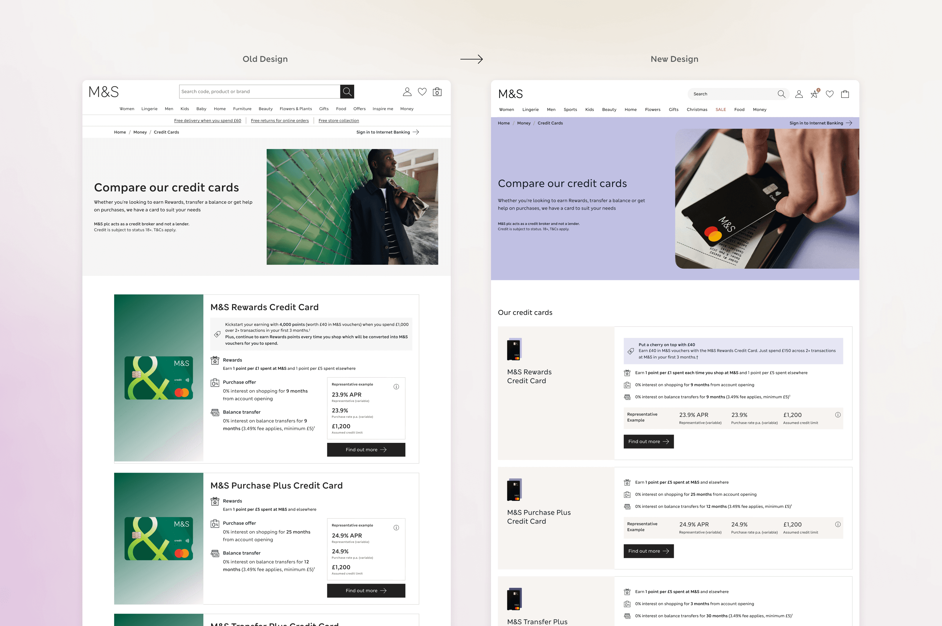
M&S Money had the scale — 7M digital users and £13.8B+ in revenue — but it was falling behind. User testing kept surfacing the same two issues: information overload and a design that no longer felt like M&S, while digital banks and fintechs had already reset what customers expected from a financial services experience.

Closing that gap meant more than a single redesign. It meant reconnecting the experience to the brand and simplifying it as we learned more from how people actually used it.

THE PROBLEM

Closing the gap between M&S Money and the market it competes in

M&S Money had the scale — 7M digital users and £13.8B+ in revenue — but it was falling behind. User testing kept surfacing the same two issues: information overload and a design that no longer felt like M&S, while digital banks and fintechs had already reset what customers expected from a financial services experience.

Closing that gap meant more than a single redesign. It meant reconnecting the experience to the brand and simplifying it as we learned more from how people actually used it.

THE PROBLEM

Closing the gap between M&S Money and the market it competes in

M&S Money had the scale — 7M digital users and £13.8B+ in revenue — but it was falling behind. User testing kept surfacing the same two issues: information overload and a design that no longer felt like M&S, while digital banks and fintechs had already reset what customers expected from a financial services experience.

Closing that gap meant more than a single redesign. It meant reconnecting the experience to the brand and simplifying it as we learned more from how people actually used it.

Sample of the old designs before rebrand and optimization

RESEARCH

From early interviews to live optimization

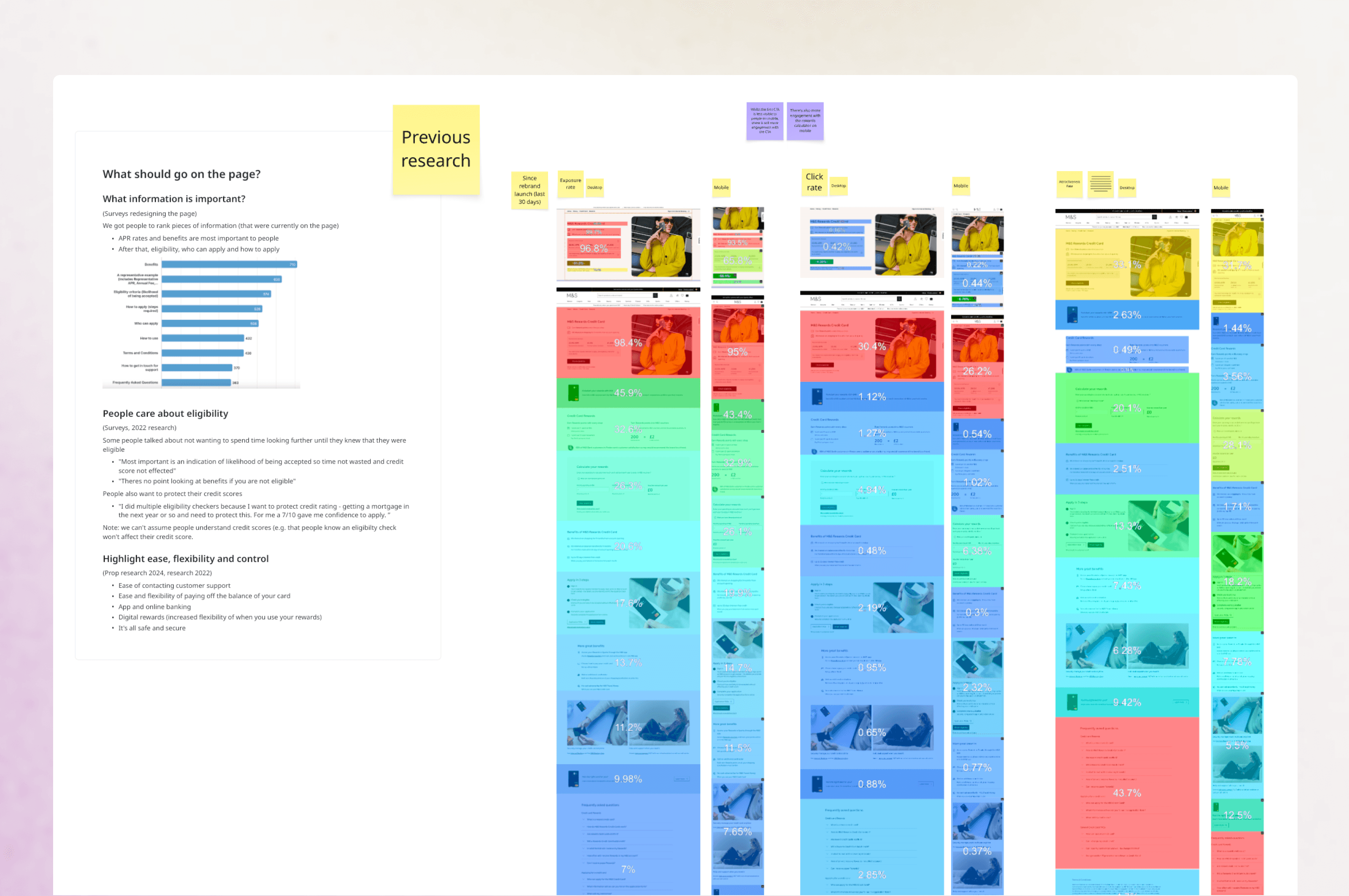
Interviews with neurodivergent, vulnerable, and everyday customers surfaced the same two complaints: too much information and too much jargon, on pages that didn't look or sound like the rest of the brand. Competitor banks had already leaned into warmth — soft colour, rounded corners, plain language — to make money less stressful to think about.

Research didn't stop at the redesign. Ongoing Maze testing, ContentSquare page analytics and live A/B experiments have shaped every round since, sharpening click-through rate and the quality of customers coming through.

RESEARCH

From early interviews to live optimization

Interviews with neurodivergent, vulnerable, and everyday customers surfaced the same two complaints: too much information and too much jargon, on pages that didn't look or sound like the rest of the brand. Competitor banks had already leaned into warmth — soft colour, rounded corners, plain language — to make money less stressful to think about.

Research didn't stop at the redesign. Ongoing Maze testing, ContentSquare page analytics and live A/B experiments have shaped every round since, sharpening click-through rate and the quality of customers coming through.

RESEARCH

From early interviews to live optimization

Interviews with neurodivergent, vulnerable, and everyday customers surfaced the same two complaints: too much information and too much jargon, on pages that didn't look or sound like the rest of the brand. Competitor banks had already leaned into warmth — soft colour, rounded corners, plain language — to make money less stressful to think about.

Research didn't stop at the redesign. Ongoing Maze testing, ContentSquare page analytics and live A/B experiments have shaped every round since, sharpening click-through rate and the quality of customers coming through.

A snapshot of the research behind the rebrand and ongoing optimization

Ideation

How do you make banking feel human inside a regulated industry?

Getting there meant sitting down with brand, product, and compliance teams early, exploring multiple directions before landing on something that felt like M&S — not just another bank.

Every idea was tested and signed off by our Financial Services compliance team before it moved forward, proving structure and creativity aren't mutually exclusive.

Ideation

How do you make banking feel human inside a regulated industry?

Getting there meant sitting down with brand, product, and compliance teams early, exploring multiple directions before landing on something that felt like M&S — not just another bank.

Every idea was tested and signed off by our Financial Services compliance team before it moved forward, proving structure and creativity aren't mutually exclusive.

Ideation

How do you make banking feel human inside a regulated industry?

Getting there meant sitting down with brand, product, and compliance teams early, exploring multiple directions before landing on something that felt like M&S — not just another bank.

Every idea was tested and signed off by our Financial Services compliance team before it moved forward, proving structure and creativity aren't mutually exclusive.

Early brand exploration

Content Square analytics after rebrand launch influenced further optimization

Iterating on the credit card hero, guided by usability testing and heatmaps

Final designs

From insight to interface

Every layout decision traced back to what research surfaced — simplified card layouts, clearer hierarchy through space and weight, and a system built to stay consistent as we kept shipping and testing.

What we created:

5+

new components

10+

responsive pages

3+

workshops run

1

design guideline doc

Responsive design for the digital rewards page

Design tokens and usage guidelines that kept the system consistent as we scaled the rebrand across every product line, shipping and testing in parallel

A modular component library built to serve all three product lines — credit cards, Travel Money, and insurance — without duplicating design work at each step

Carrying the new brand system into the insurance journey — Eucalyptus tones, simplified layouts, and the same clarity principles applied across the rest of M&S Money

Components tailored to insurance-specific content — coverage details, disclaimers, and quote summaries — while staying visually consistent with the wider system
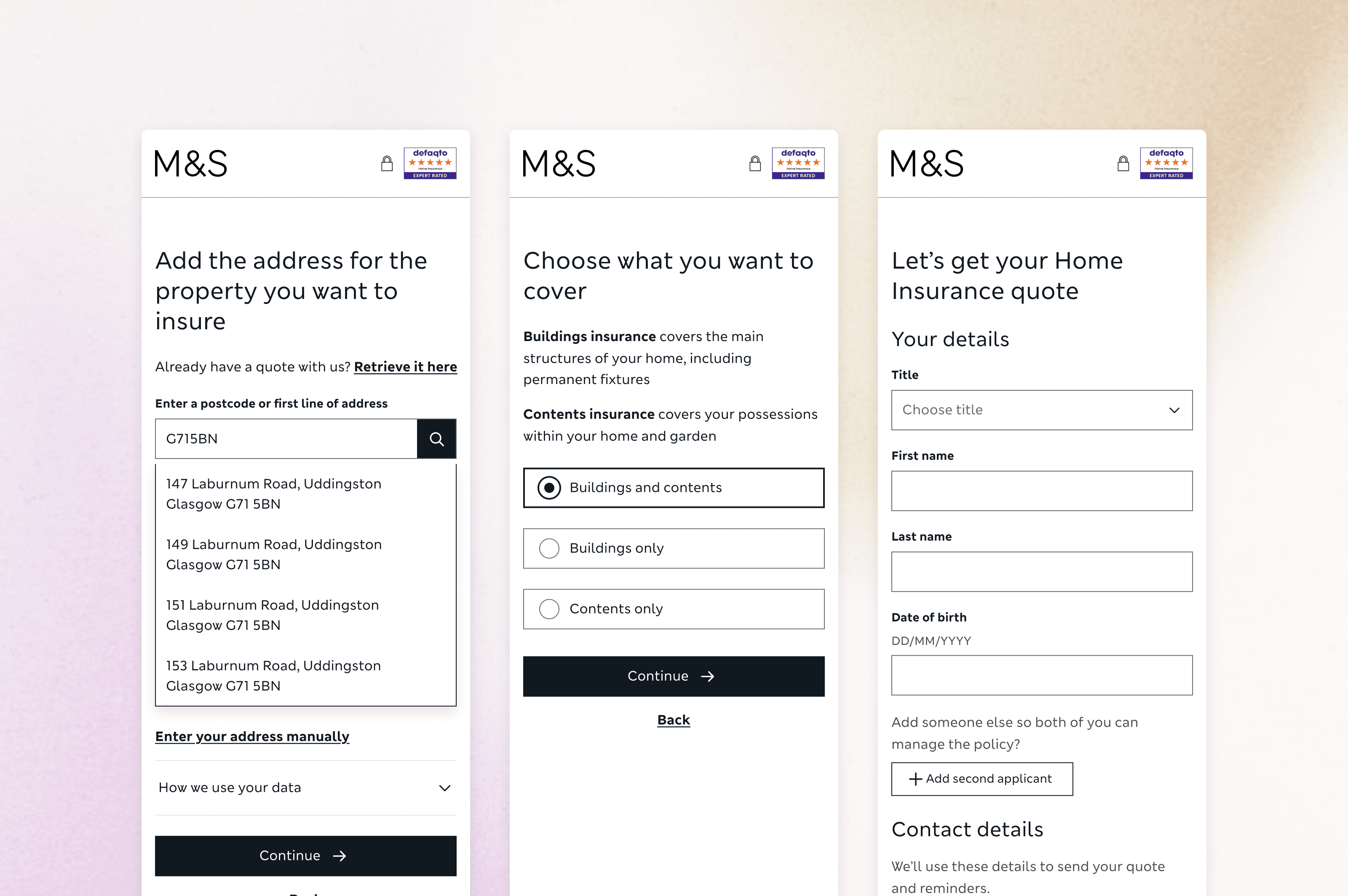
The quote-to-purchase flow redesigned to cut the jargon and information overload our research flagged as the biggest source of drop-off

impact

The results so far

Since the launch of rebrand in April 2026, we’ve received positive reaction
from customers and stakeholders within M&S.

We continue to monitor stats, analytics and company goals to continue optimization within the space.

impact

The results so far

Since the launch of rebrand in April 2026, we’ve received positive reaction
from customers and stakeholders within M&S.

We continue to monitor stats, analytics and company goals to continue optimization within the space.

impact

The results so far

Since the launch of rebrand in April 2026, we’ve received positive reaction
from customers and stakeholders within M&S.

We continue to monitor stats, analytics and company goals to continue optimization within the space.

Since launch in April 2026, we've seen:

0k+

M&S Money landing

page views

0k+

successful credit card applications

+0%

scroll depth — users are engaging

deeper with content than previously

Cookied and M&S Money magazine made for launch!
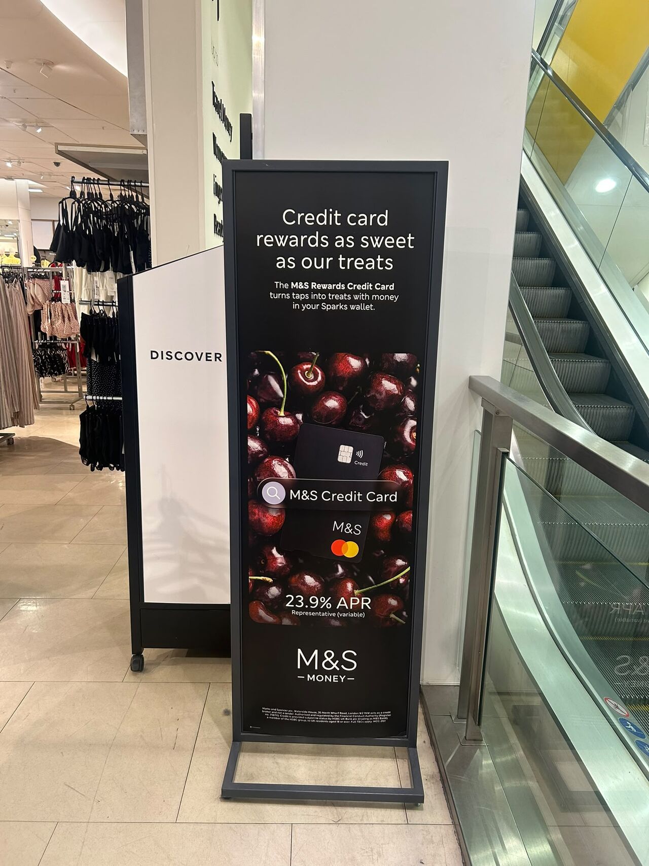
M&S Money with the new rebrand on banners across London!

Reflection

My takeaways

Research wins arguments 🔬

Whenever stakeholders pushed back, I stopped arguing my opinion and just showed them what customers had actually said. It worked almost every time.

Collaboration defines what's possible 🫱🏼‍🫲🏽

None of this happened in a vacuum — the workshops with brand, product, and compliance were honestly where most of the good ideas came from.

A good future proof design system is worth the investment 🎨

Once we had a real design system in place, everything sped up. I wish I'd pushed for it sooner instead of patching things page by page.

Nicole Lozano

Nicole Lozano

Nicole Lozano