
Konrad Portal is an employee portal experience for a consultancy agency of 500+ workers across 6 offices worldwide
I worked as part of a team of consultants and developers to update and improve the user experience of this internal platform. I played a key role in redesigning the Dashboard and Events Calendar, and contributed to the upkeep of the Design System.
Role
Design systems
Product Design
User experience
Team
2 designers
1 project manager
4 developers
Timeline
6 months in 2022
Revisited January 2026
Platform
Responsive web design
Developer build specs

THE PROBLEM
A system that couldn't keep up
The existing design system was disorganized, missing key states, and inconsistent — colors and spacing were just raw values with no shared meaning. Developers were often left guessing.
As Konrad kept growing, that gap between design and code only got more expensive to maintain.
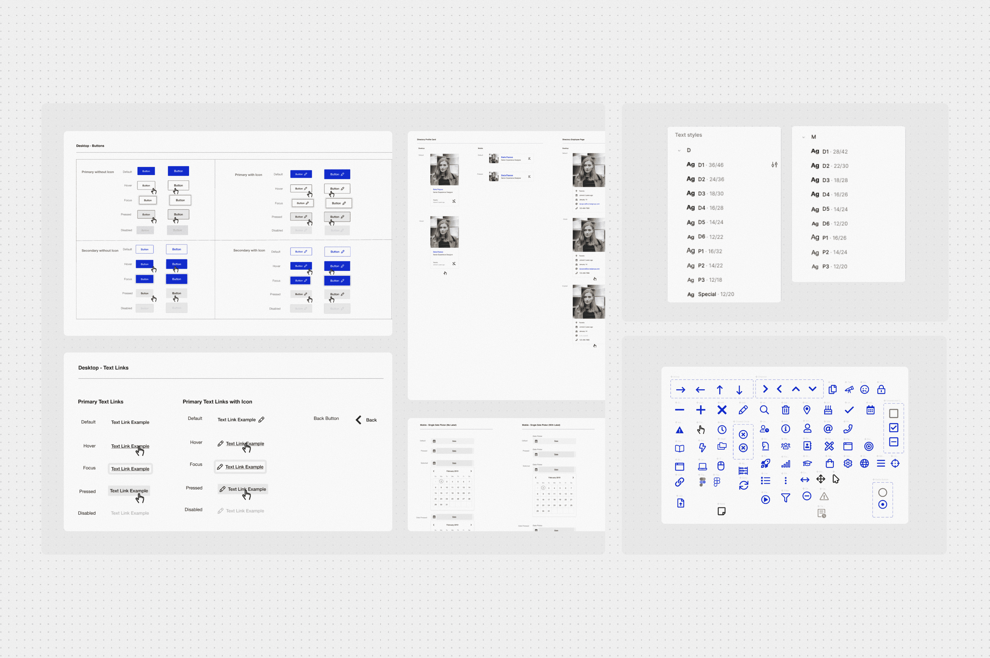
Snippets of the original design system

Highlighting pain points
RESEARCH
Listening before rebuilding
I started with a full audit of the existing system and conversations with designers and developers, not Figma. Designers wanted flexible components and simple theming; developers wanted tokens that mapped directly to code.
Both sides agreed on the real issue: nothing was speaking the same language.

Snapshot of research done for rebrand and optimization

Snapshot of research done for rebrand and optimization
Building the System
Starting with the ingredients
We approached the rebuild in layers — primitive tokens first (the raw values), then semantic tokens that gave those values real meaning and context. Buttons, cards, and text styles all began referencing one shared source of truth.
Slots replaced rigid variants, letting components flex without ever breaking their connection to the system.

Setting up variables

Revisiting the iconset

Improving documentation of components and states
Final designs
Putting it all together
Every color, spacing value, and shadow across the new components — and the Portal Dashboard itself — is now driven by a token instead of a hardcoded value. Change one primitive, and it cascades across the entire product automatically.
The dashboard became the proof of concept: a cleaner, more consistent hub built entirely on the new foundation.

Responsive design for the digital rewards page

Example

Snapshot of variables and design guidelines to use our component set

Snapshot of variables and design guidelines to use our component set

Snapshot of variables and design guidelines to use our component set

Snapshot of variables and design guidelines to use our component set
Reflection
What I learned
Governance matters from day one hammer 👩🏻⚖️
Without clear ownership of the system, contributions from different team members created inconsistency. Establishing rules early would have saved significant rework.
Tokens need a naming conversation 🗣️
Getting alignment on token naming conventions between design and development took longer than expected. It's a decision that affects everything downstream.
Documentation is part of the design 📖
Components without clear usage guidance get misused or ignored. Writing documentation as you build, not after, is the only way to keep it accurate.
If I was doing this again… 👀
I would involve developers in token decisions earlier — earlier developer input would have meant fewer naming changes and less back and forth.
I would test components in real product context sooner — components were tested in isolation but some edge cases only appeared when placed in actual page layouts.