
Corient, one of the largest U.S. RIAs serving ultra-affluent clients, sought a refreshed digital presence that blended quiet sophistication, warmth, and innovation
As lead designer, I owned the design system, prototyping, interaction design, and developer handoff, working alongside two other designers and two project managers throughout 2024.
Role
Lead designer
Design system
Prototyping
Developer handoff
Timeline
Team
3 designers
2 project managers
Platform
Responsive web design

THE PROBLEM
How might we balance quiet sophistication with innovation while delivering something elevated yet practical under fast-moving timelines?
Corient lacked a clear vision for its digital future, and its existing presence felt outdated and fragmented across business units. The team needed a single design system that could scale across multiple microsites.
That system also had to be flexible enough to support campaigns while staying distinct and premium enough to speak to high-net-worth clients, all under fast-moving timelines.

A snapshot of the research behind the rebrand and ongoing optimization
RESEARCH
Benchmarking set the bar before we designed anything
We gathered examples of best-in-class digital experiences to inform our direction and establish a clear baseline for quality.
That benchmarking shaped how we approached structure, visuals, and motion for everything that followed.
Ideation
Structure first, ambitious concepts second
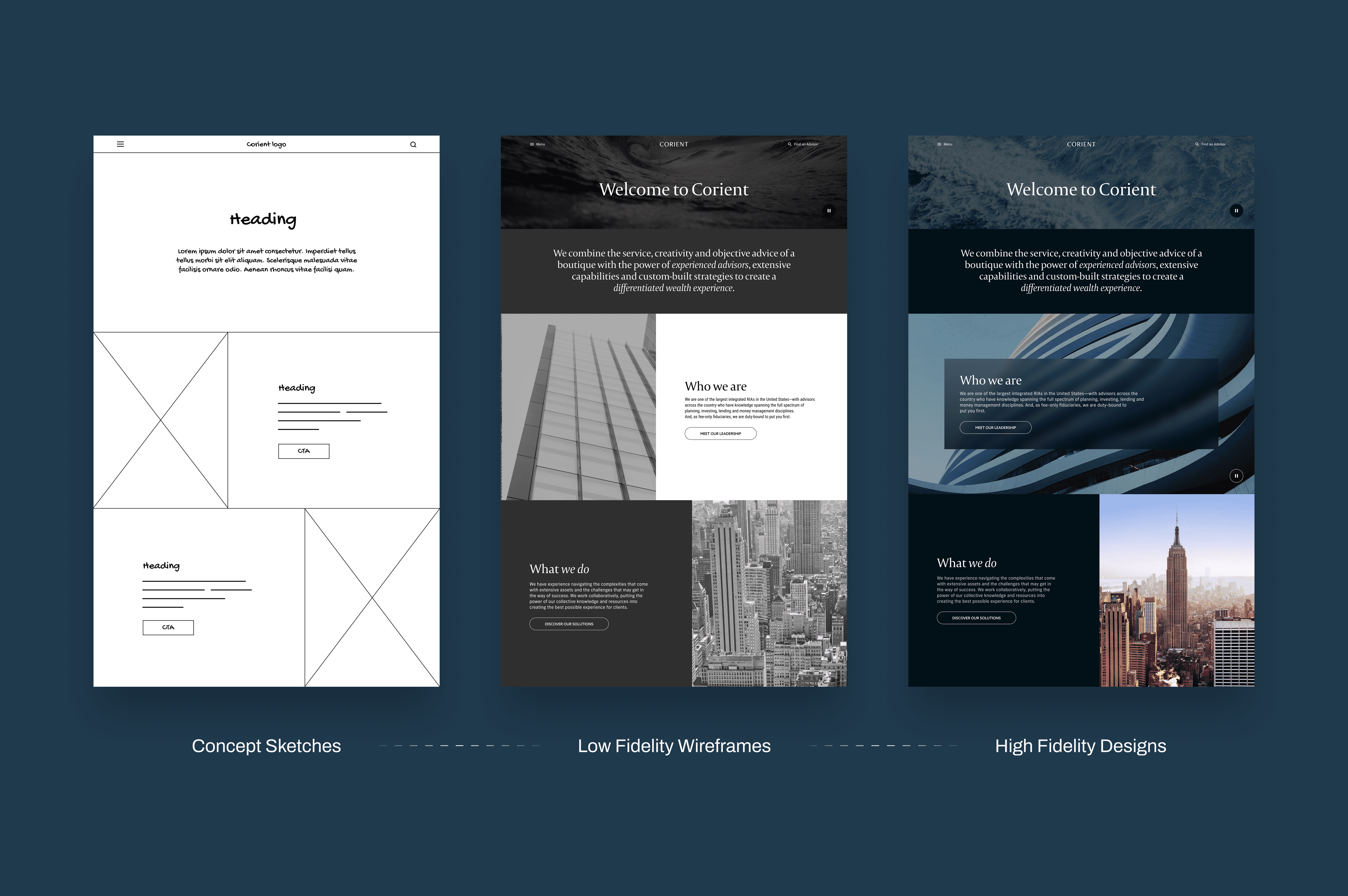
Low-fidelity wireframes let us align on content hierarchy and user journeys before investing in visual detail, so stakeholders were bought into the fundamentals early. From there, we pushed into future-state explorations that went beyond Corient's current brand constraints.
Those explorations weren't tied to immediate requirements. They were built to inspire long-term product vision and surface where the brand could grow next.
Early brand exploration
Final designs
Bringing quiet sophistication into motion
High-fidelity reskins brought Corient's brand guidelines, refined UI, and subtle animation to life, including scroll-based motion on the main site that guides users through the brand's story in a more immersive way.
We also led CI Private Wealth's redesign from concept to launch, built around modern aesthetics, intuitive user journeys, and a comprehensive design system. That system was built for consistency and scale across both current and future microsites.

Responsive design for the digital rewards page

Carrying the new brand system into the insurance journey — Eucalyptus tones, simplified layouts, and the same clarity principles applied across the rest of M&S Money

Design tokens and usage guidelines that kept the system consistent as we scaled the rebrand across every product line, shipping and testing in parallel

Design tokens and usage guidelines that kept the system consistent as we scaled the rebrand across every product line, shipping and testing in parallel

A modular component library built to serve all three product lines — credit cards, Travel Money, and insurance — without duplicating design work at each step
impact
A foundation for what's next
The art of the possible explorations became a foundation for Corient's next phase, showing how thoughtful design can modernize and future-proof a legacy financial brand.
The redesigned site has since launched.
In the first year since launch,
page views
unique visitors
lead generation forms, turning that traffic into real pipeline interest
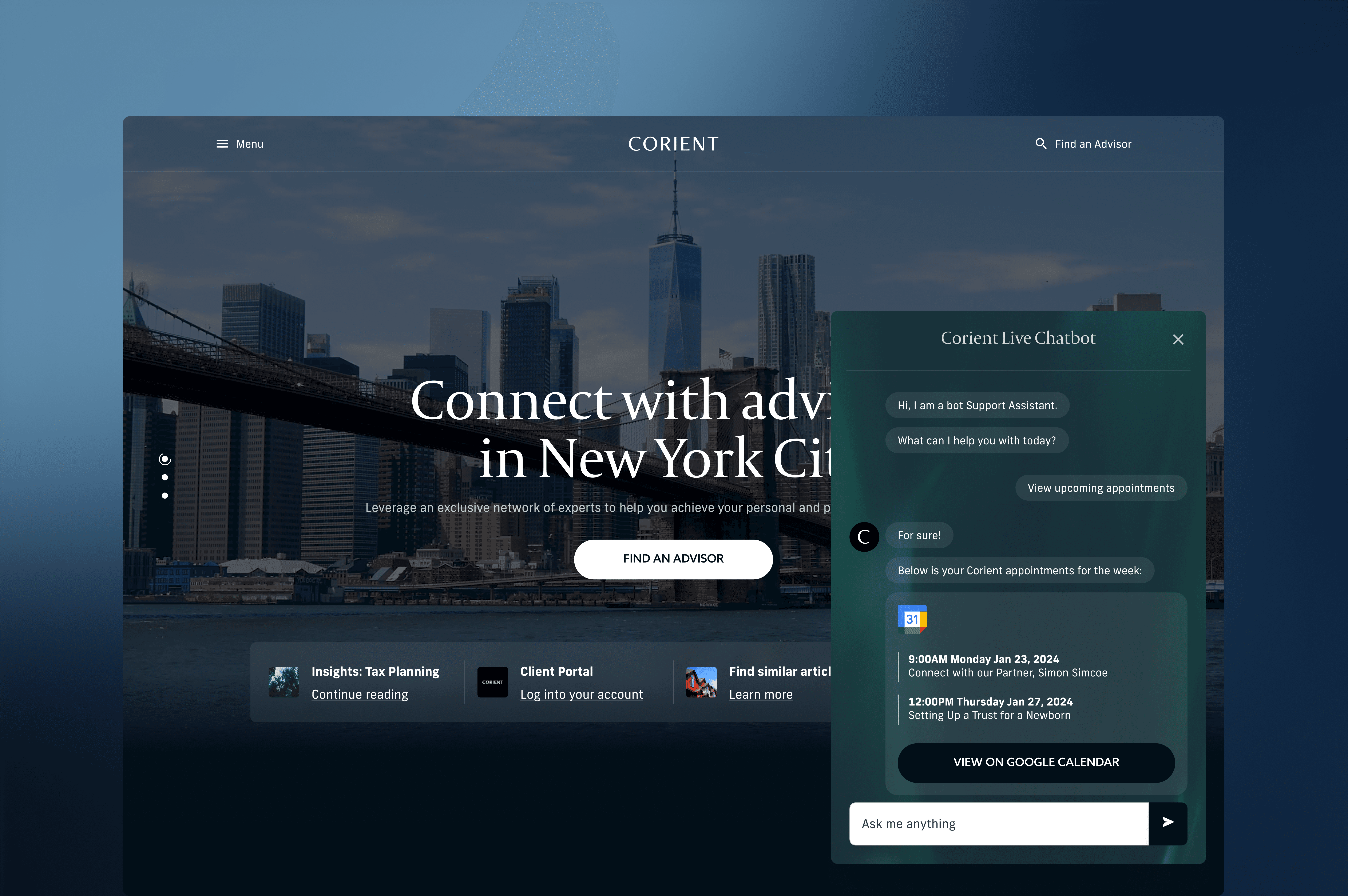
AI chatbot enhancements
Reflection
Project takeaways
Speed doesn’t mean sacrificing quality
Tight timelines can still produce strong creative outcomes with clear prioritization and collaboration.
Art of the possible explorations are invaluable
They not only push creativity but also build alignment and excitement around the future vision.
Design systems are living assets
Building them early and maintaining flexibility ensured the Corient brand could evolve smoothly.
Stakeholder alignment is key
Frequent, structured feedback loops reduced rework and helped the team stay unified around shared design goals.